Looking into...
F/7.1; Exposure 1/60; ISO/100
F/7.1; Exposure 1/60; ISO/100
This picture was taken in a home studio, where I used soft box light and main light to make half of the face brighter than the other one, although I still tried to keep the whole face in focus. This helped me to achieve a moody effect of a personality consisting of two sides: bright and dark. The mask is a symbol of posture we assume to hide our true personality.The use of both beauty dish and soft-box was helpful in achieving good contrast and well-defined facial features.
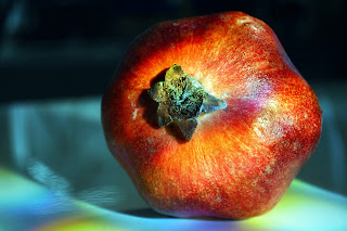
Pomegranate
F/5.6; Exposure 1/20; ISO/100
F/5.6; Exposure 1/20; ISO/100
This is an example of creative photography. The play with lighting and colour is supposed to make the subject matter more vivid. The choice of aperture ensures that the focus is placed primarily on the fruit, whereas the blurred table serves as the perfect background which does not distract the viewer. At the same time, the sublime shadow makes it easier for the viewer to locate the fruit in space. Honeycomb grids create a colorful effect of light beams.
Orchids
F/25; Exposure 1/25; ISO/100
F/25; Exposure 1/25; ISO/100
The aim of using the F/25 aperture was to provide a large depth of field so that each detail of the petal is clear and visible. The rear light could have been adjusted slightly differently to make sure that all the flowers receive similar lighting. As it stands, the upper left corner of the image (together with its petal) is somewhat dark.
Jewelry
F/5.6; Exposure 1/60; ISO/100
F/5.6; Exposure 1/60; ISO/100
The fact that I used only one source of lighting (i.e. flash) posed quite a challenge getting the right focus. The glass surface with scratches slightly disrupt the viewer's attention. However, I still managed to create a good bokeh by deciding on a short depth of field and putting the largest element of the jewelry in focus.
Purple flowers
F/20; Exposure 1/100; ISO/100
F/20; Exposure 1/100; ISO/100
This composition is about combination of extremes. Extreme tones are supposed to match the clear and crispy texture of the wooden background. At the same time, it is about life (organic flower) and lifeless matter (wooden plank). The vivid texture of both foreground and background was achieved with a high F value.
Glassware
F/18; Exposure 1/160; ISO/100
F/18; Exposure 1/160; ISO/100
The high F value adds a large depth of field to the image and allows the viewer to visually explore the twirls inside the glassware. Although the exposure time was short, I still used the tripod to avoid the motion blur which would have spoiled the crispy texture and detail of the glassware. I also managed to keep the bottom edge visible despite the low key.
Commercial photography
F/5.6; Exposure 1/60; ISO/100
F/5.6; Exposure 1/60; ISO/100
I used a short depth of field on purpose to avoid getting glass scratches into focus. Thanks to this the coffee beans on the glass surface look very lively. The blurred objects beneath the glass table are old cameras. The light positioned in the rear part of the set was used to slightly dim the background, which matches the dark tones of the coffee beans. But at the same time, the external flash allowed me to get enough white balance to depict the coffee beans in their natural colour. A C-stand with boom arm was an effective tool for taking the photo from above and keeping the camera stable.


I take it that Noreen told you which ones I chose? And bad Agnes, she told me that you two had intentionally submitted too many images - "thought I'd only given seven" wasn't quite true then?
ReplyDeleteI intentionally printed 11 images so that I keep some for myself for a different occasion...but I'm still bad Agnes, I guess...
ReplyDeleteI'll let you off seeing as I like your work :)
ReplyDeleteGood blog Agnes, I will re-assess your work on Monday and record it as a distinction (subject to verification)
ReplyDelete